
How To Validate Forms In Flutter ?
By Philomathes in Flutter
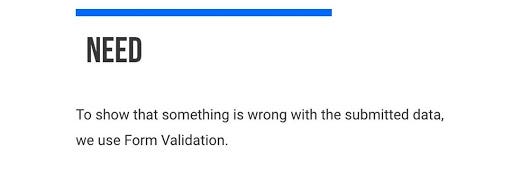
Apps often require users to enter information into a text field. For example, you might require users to log in with an email address and password combination.
To make apps secure and easy to use we check following pointers :
- Whether the information the user has provided is valid.
- If the user has correctly filled out the form
- If the user submits incorrect information, display a friendly error message letting them know what went wrong.
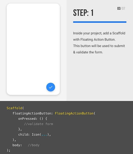
How to add validation to a form that has a single text field using the following steps:
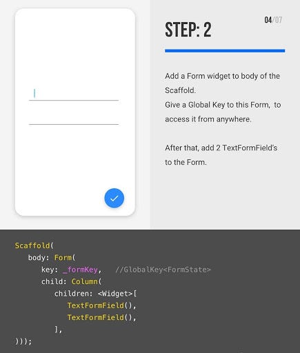
- Create a Form with a GlobalKey .
- Add a TextFormField with validation logic.
- Create a button to validate and submit the form.
Form
Forms are an integral part of all modern mobile and web applications. It is mainly used to interact with the app as well as gather information from the users. They can perform many tasks, which depend on the nature of your business requirements and logic, such as authentication of the user, adding user, searching, filtering, ordering, booking, etc. A form can contain text fields, buttons, checkboxes, radio buttons, etc.
When you create a form, it is necessary to provide the GlobalKey. This key uniquely identifies the form and allows you to do any validation in the form fields. The form widget uses child widget TextFormField to provide the users to enter the text field. This widget renders a material design text field and also allows us to display validation errors when they occur .
Here you can use any button or clickable widget . Inside this class, we define a global key as _formKey. This key holds a FormState and can use to retrieve the form widget.
Why we are using Textformfield ? can we use TextField ?
TextFormField wraps a TextField and integrates it with the enclosing Form . This provides additional functionality, such as validation and integration with other FormField widgets.
Deep dive into TextFormField
TextFormField({
  Key key,
  this.controller,
  String initialValue,
  FocusNode focusNode,
  InputDecoration decoration = const InputDecoration(),
  TextInputType keyboardType,
  TextCapitalization textCapitalization = TextCapitalization.none,
  TextInputAction textInputAction,
  TextStyle style,
  StrutStyle strutStyle,
  TextDirection textDirection,
  TextAlign textAlign = TextAlign.start,
  TextAlignVertical textAlignVertical,
  bool autofocus = false,
  bool readOnly = false,
  ToolbarOptions toolbarOptions,
  bool showCursor,
  bool obscureText = false,
  bool autocorrect = true,
  bool enableSuggestions = true,
  bool autovalidate = false,
  bool maxLengthEnforced = true,
  int maxLines = 1,
  int minLines,
  bool expands = false,
  int maxLength,
  ValueChanged<String> onChanged,
  GestureTapCallback onTap,
  VoidCallback onEditingComplete,
  ValueChanged<String> onFieldSubmitted,
  FormFieldSetter<String> onSaved,
  FormFieldValidator<String> validator,
  List<TextInputFormatter> inputFormatters,
  bool enabled = true,
  double cursorWidth = 2.0,
  Radius cursorRadius,
  Color cursorColor,
  Brightness keyboardAppearance,
  EdgeInsets scrollPadding = const EdgeInsets.all(20.0),
  bool enableInteractiveSelection = true,
  InputCounterWidgetBuilder buildCounter,
})InputDecoration({
  this.icon,
  this.labelText,
  this.labelStyle,
  this.helperText,
  this.helperStyle,
  this.helperMaxLines,
  this.hintText,
  this.hintStyle,
  this.hintMaxLines,
  this.errorText,
  this.errorStyle,
  this.errorMaxLines,
  this.hasFloatingPlaceholder = true,
  this.isDense,
  this.contentPadding,
  this.prefixIcon,
  this.prefix,
  this.prefixText,
  this.prefixStyle,
  this.suffixIcon,
  this.suffix,
  this.suffixText,
  this.suffixStyle,
  this.counter,
  this.counterText,
  this.counterStyle,
  this.filled,
  this.fillColor,
  this.focusColor,
  this.hoverColor,
  this.errorBorder,
  this.focusedBorder,
  this.focusedErrorBorder,
  this.disabledBorder,
  this.enabledBorder,
  this.border,
  this.enabled = true,
  this.semanticCounterText,
  this.alignLabelWithHint,
})
Types of validation
- Check digit
- How it works : The last one or two digits in a code are used to check the other digits are correct.
- Example usage : Bar code readers in supermarkets use check digits.
- Format check
- How it works : Checks the data is in the right format ,In flutter we use RegEx for format checking .
- Example usage : Gmail id , country code ,etc .
- Length check
- How it works : Checks the data isn’t too short or too long.
- Example usage : A password which needs to be six letters long.
- Presence check
- How it works : Checks that data has been entered into a field.
- Example usage : In most databases a key field cannot be left blank.
- Range check
- How it works : Checks that a value falls within the specified range.
- Example usage : Number of hours worked must be less than 50 and more than 0.
Time to see full code
import 'package:flutter/material.dart';void main() => runApp(MyApp());class MyApp extends StatelessWidget {
  @override
  Widget build(BuildContext context) {
    final appTitle = 'Form Validation Demo';return MaterialApp(
      title: appTitle,
      home: Scaffold(
        appBar: AppBar(
          title: Text(appTitle),
        ),
        body: MyCustomForm(),
      ),
    );
  }
}// Create a Form widget.
class MyCustomForm extends StatefulWidget {
  @override
  MyCustomFormState createState() {
    return MyCustomFormState();
  }
}// Create a corresponding State class.
// This class holds data related to the form.
class MyCustomFormState extends State<MyCustomForm> {
  // Create a global key that uniquely identifies the Form widget
  // and allows validation of the form.
  //
  // Note: This is a GlobalKey<FormState>,
  // not a GlobalKey<MyCustomFormState>.
  final _formKey = GlobalKey<FormState>();@override
  Widget build(BuildContext context) {
    // Build a Form widget using the _formKey created above.
    return Form(
      key: _formKey,
      child: Column(
        crossAxisAlignment: CrossAxisAlignment.start,
        children: <Widget>[
          TextFormField(
            validator: (value) {
              if (value.isEmpty) {
                return 'Please enter some text';
              }
              return null;
            },
          ),
          Padding(
            padding: const EdgeInsets.symmetric(vertical: 16.0),
            child: RaisedButton(
              onPressed: () {
                // Validate returns true if the form is valid, or false
                // otherwise.
                if (_formKey.currentState.validate()) {
                  // If the form is valid, display a Snackbar.
                  Scaffold.of(context)
                      .showSnackBar(SnackBar(content: Text('Processing Data')));
                }
              },
              child: Text('Submit'),
            ),
          ),
        ],
      ),
    );
  }
}
Leave a Comment
You must be logged in to post a comment.