Deep Dive Into Buttons & Clickable Widgets In Flutter
By Philomathes in Flutter
We can not imagine any language that has not to click event because without click it’s very hard to trigger any actions. So here in Flutter, we are talking about buttons and clickable widgets very quickly in the flutter.
In this blog we are going to discuss pre-define buttons and clickable widgets in Flutter as follows :
- FlatButton
- RaisedButton
- FloatingActionButton
- IconButton
- InkWell
- GestureDetector
- DropdownButton
- MaterialButton
- OutlineButton
- RadioButton
- RadioListTileButton
- PopupMenuButton
FlatButton
- A simple button that has not much-highlighted decoration, Mostly use on toolbar, dialogue and etc.
- FlatButton has two required property child and onPressed()
FlatButton(
          child: Text('I am FlatButton'),
          onPressed: (){
            print('You tapped on FlatButton');
          },
        ),
Here we are using the child as a Text Widget but you can use as you want and suitable for Flutter. onPressed() is a simple voidCallback that is call back with no argument and no return.
Below are more property of FlatButton widget.
    Key key,
    @required VoidCallback onPressed,
    ValueChanged<bool> onHighlightChanged,
    ButtonTextTheme textTheme,
    Color textColor,
    Color disabledTextColor,
    Color color,
    Color disabledColor,
    Color highlightColor,
    Color splashColor,
    Brightness colorBrightness,
    EdgeInsetsGeometry padding,
    ShapeBorder shape,
    Clip clipBehavior = Clip.none,
    MaterialTapTargetSize materialTapTargetSize,
    @required Widget child,

Note
You can find all the properties of any widget/method by short-cut Mac User — (Command+ClickOnWidget/Method) for others may be use Ctrl instead of Command.
RaisedButton
- It’s material button same like flat button but it has an elevation that will increase when it pressed.
- Do not used with Widgets that have already raise-content like dialogue, card etc. Use with flat content like a long list, a wide range of widgets.
RaisedButton(
          child: Text('I am RaisedButton'),
          onPressed: (){
            print('You tapped on RaisedButton');
          },
        ),
Below are more property of RaisedButton widget.
RaisedButton({
  Key key,
  @required VoidCallback onPressed,
  VoidCallback onLongPress,
  ValueChanged<bool> onHighlightChanged,
  ButtonTextTheme textTheme,
  Color textColor,
  Color disabledTextColor,
  Color color,
  Color disabledColor,
  Color focusColor,
  Color hoverColor,
  Color highlightColor,
  Color splashColor,
  Brightness colorBrightness,
  double elevation,
  double focusElevation,
  double hoverElevation,
  double highlightElevation,
  double disabledElevation,
  EdgeInsetsGeometry padding,
  ShapeBorder shape,
  Clip clipBehavior = Clip.none,
  FocusNode focusNode,
  bool autofocus = false,
  MaterialTapTargetSize materialTapTargetSize,
  Duration animationDuration,
  Widget child,
})

FloatingActionButton
- Simple circular icon with hover, mostly single per screen.
- Display on-screen for triggering positive action like, add, share or navigate to screen and etc.
- Use child as Icon widget, not any rule you can also use whatever
- Mostly use with Scaffold widget that has property name is floatingActionButton
FloatingActionButton(
          child: Icon(Icons.add),
          onPressed: (){
            print('You tapped on FloatingActionButton');
          },
        ),
Below are more property of FloatingActionButton widget.
FloatingActionButton({
  Key key,
  this.child,
  this.tooltip,
  this.foregroundColor,
  this.backgroundColor,
  this.focusColor,
  this.hoverColor,
  this.splashColor,
  this.heroTag = const _DefaultHeroTag(),
  this.elevation,
  this.focusElevation,
  this.hoverElevation,
  this.highlightElevation,
  this.disabledElevation,
  @required this.onPressed,
  this.mini = false,
  this.shape,
  this.clipBehavior = Clip.none,
  this.focusNode,
  this.autofocus = false,
  this.materialTapTargetSize,
  this.isExtended = false,
})

IconButton
- Simple display touchable icon, Trigger action when clicked.
- Mostly use with AppBar widget with actions property.
IconButton(
    icon: Icon(Icons.volume_up),
    tooltip: 'Increase volume by 10%',
    onPressed: () { print('Volume button clicked');},
);
Below are more property of IconButton widget.
IconButton({
  Key key,
  this.iconSize = 24.0,
  this.padding = const EdgeInsets.all(8.0),
  this.alignment = Alignment.center,
  @required this.icon,
  this.color,
  this.focusColor,
  this.hoverColor,
  this.highlightColor,
  this.splashColor,
  this.disabledColor,
  @required this.onPressed,
  this.focusNode,
  this.autofocus = false,
  this.tooltip,
  this.enableFeedback = true,
})
DropdownButton
- A material design button for selecting from a list of items.
- The button shows the currently selected item as well as an arrow that opens a menu for selecting another item.
- The onChanged callback should update a state variable that defines the dropdown’s value.
DropdownButton(
  value: _selectedGender,
  items: _dropDownItem(),
  onChanged: (value){
    _selectedGender =value;
    setState(() {

    });
  },
  hint: Text("  Select Gender  "),
),
Below are more property of DropdownButton widget.
DropdownButton({
  Key key,
  @required this.items,
  this.selectedItemBuilder,
  this.value,
  this.hint,
  this.disabledHint,
  @required this.onChanged,
  this.elevation = 8,
  this.style,
  this.underline,
  this.icon,
  this.iconDisabledColor,
  this.iconEnabledColor,
  this.iconSize = 24.0,
  this.isDense = false,
  this.isExpanded = false,
  this.itemHeight = kMinInteractiveDimension,
  this.focusColor,
  this.focusNode,
  this.autofocus = false,
})


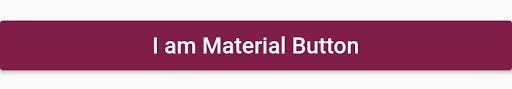
MaterialButton
- The button’s size will expand to fit the child widget
- MaterialButtons whose onPressed and onLongPress callbacks are null will be disabled.
MaterialButton(
minWidth: 200.0,
height: 35,
color: Color(0xFF801E48),
child: new Text('I am Material Button',
style: new TextStyle(fontSize: 16.0, color: Colors.white)),
onPressed: () {},
),
Below are more property of MaterialButton widget.
MaterialButton({
  Key key,
  @required this.onPressed,
  this.onLongPress,
  this.onHighlightChanged,
  this.textTheme,
  this.textColor,
  this.disabledTextColor,
  this.color,
  this.disabledColor,
  this.focusColor,
  this.hoverColor,
  this.highlightColor,
  this.splashColor,
  this.colorBrightness,
  this.elevation,
  this.focusElevation,
  this.hoverElevation,
  this.highlightElevation,
  this.disabledElevation,
  this.padding,
  this.shape,
  this.clipBehavior = Clip.none,
  this.focusNode,
  this.autofocus = false,
  this.materialTapTargetSize,
  this.animationDuration,
  this.minWidth,
  this.height,
  this.enableFeedback = true,
  this.child,
})
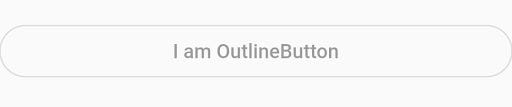
OutlineButton
- Similar to a FlatButton with a thin grey rounded rectangle border.
- The outline button’s border shape is defined by shape and its appearance is defined by borderSide, disabledBorderColor, and highlightedBorderColor.
- By default, the border is a one-pixel wide grey rounded rectangle that does not change when the button is pressed or disabled.
- By default the button’s background is transparent.
- If the onPressed or onLongPress callbacks are null, then the button will be disabled and by default will resemble a flat button in the disabledColor.
OutlineButton(
    child: new Text("Button text"),
    onPressed: null,
    shape: new RoundedRectangleBorder(borderRadius: new BorderRadius.circular(30.0))
),
Below are more property of OutlineButton widget.
OutlineButton({
  Key key,
  @required VoidCallback onPressed,
  VoidCallback onLongPress,
  ButtonTextTheme textTheme,
  Color textColor,
  Color disabledTextColor,
  Color color,
  Color focusColor,
  Color hoverColor,
  Color highlightColor,
  Color splashColor,
  double highlightElevation,
  this.borderSide,
  this.disabledBorderColor,
  this.highlightedBorderColor,
  EdgeInsetsGeometry padding,
  ShapeBorder shape,
  Clip clipBehavior = Clip.none,
  FocusNode focusNode,
  bool autofocus = false,
  Widget child,
})
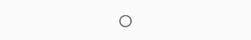
RadioButton
- The radio button itself does not maintain any state.
- the radio invokes the onChanged callback, passing the value as a parameter.
- Most widgets will respond to onChanged by calling State.setState to update the radio button’s groupValue.
Radio(
      value: 1,
      groupValue: selectedRadio,
      activeColor: Colors.green,
      onChanged: (val) {
        print("Radio $val");
        setSelectedRadio(val);
      },
    ),
Below are more property of Radio widget.
Radio({
  Key key,
  @required this.value,
  @required this.groupValue,
  @required this.onChanged,
  this.activeColor,
  this.focusColor,
  this.hoverColor,
  this.materialTapTargetSize,
  this.focusNode,
  this.autofocus = false,
})
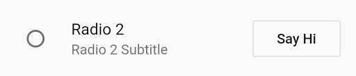
RadioListTile
- A ListTile with a Radio. In other words, a radio button with a label.
- The entire list tile is interactive: tapping anywhere in the tile selects the radio button.
- The value, groupValue, onChanged, and activeColor properties of this widget are identical to the similarly-named properties on the Radio widget
- The title, subtitle, isThreeLine, and dense properties are like those of the same name on ListTile.
RadioListTile(
  value: 2,
  groupValue: selectedRadioTile,
  title: Text("Radio 2"),
  subtitle: Text("Radio 2 Subtitle"),
  onChanged: (val) {
    print("Radio Tile pressed $val");
    setSelectedRadioTile(val);
  },
  activeColor: Colors.red,
  secondary: OutlineButton(
    child: Text("Say Hi"),
    onPressed: () {
      print("Say Hello");
    },
  ),
  selected: false,
),
Below are more property of RadioListTile widget.
RadioListTile({
  Key key,
  @required this.value,
  @required this.groupValue,
  @required this.onChanged,
  this.activeColor,
  this.title,
  this.subtitle,
  this.isThreeLine = false,
  this.dense,
  this.secondary,
  this.selected = false,
  this.controlAffinity = ListTileControlAffinity.platform,
})
PopupMenuButton
- Displays a menu when pressed and calls onSelected when the menu is dismissed because an item was selected.
- The value passed to onSelected is the value of the selected menu item.
- One of child or icon may be provided, but not both. If icon is provided, then PopupMenuButton behaves like an IconButton.
- If both are null, then a standard overflow icon is created (depending on the platform).
PopupMenuButton<int>(
itemBuilder: (context) => [
PopupMenuItem(
value: 1,
child: Text("First"),),
PopupMenuItem(
value: 2,
child: Text("Second"),),
],
),
Below are more property of PopupMenuButton widget.
PopupMenuButton({
  Key key,
  @required this.itemBuilder,
  this.initialValue,
  this.onSelected,
  this.onCanceled,
  this.tooltip,
  this.elevation,
  this.padding = const EdgeInsets.all(8.0),
  this.child,
  this.icon,
  this.offset = Offset.zero,
  this.enabled = true,
  this.shape,
  this.color,
  this.captureInheritedThemes = true,
})

Clickable widget
We can make any widget clickable or you can give any widget capability to detect the gesture.
There are two widgets which helps us in Flutter to give this functionality
- InkWell
- GestureDetector
InkWell
- A rectangle area of the material that response on touch.
- Simply you can wrap it to any material widget so that will be clickable.
InkWell(
   onTap: () {
     print('Clicked on URL by InkWell Widget');
   },
   child: Text("https://quickstartflutterdart.blogspot.in/",
       style: TextStyle(
         color: Colors.blue,
         fontSize: 13,
         decoration: TextDecoration.underline)),
    );

GestureDetector
- It’s work same like InkWell widget but it has more powerful click events.
- It has many click/drag and other events.
GestureDetector(
      onTap: () {
        print('Clicked on URL by GestureDetector Widget');
      },
      child: Text("https://quickstartflutterdart.blogspot.in/",
        style: TextStyle(
        color: Colors.blue,
        fontSize: 13,
        decoration: TextDecoration.underline)
      ),
    );
It works the same. But instead of onTap(), it has so many other events.
this.child,
this.onTapDown,
this.onTapUp,
this.onTap,
this.onTapCancel,
this.onDoubleTap,
this.onLongPress,
this.onLongPressUp,
this.onVerticalDragDown,
this.onVerticalDragStart,
this.onVerticalDragUpdate,
this.onVerticalDragEnd,
this.onVerticalDragCancel,
this.onHorizontalDragDown,
this.onHorizontalDragStart,
this.onHorizontalDragUpdate,
this.onHorizontalDragEnd,
this.onHorizontalDragCancel,
this.onForcePressStart,
this.onForcePressPeak,
this.onForcePressUpdate,
this.onForcePressEnd,
this.onPanDown,
this.onPanStart,
this.onPanUpdate,
this.onPanEnd,
this.onPanCancel,
this.onScaleStart,
this.onScaleUpdate,
this.onScaleEnd,
this.behavior,
this.excludeFromSemantics = false
Leave a Comment
You must be logged in to post a comment.